UI Challenge: Sliding Highlighter
Make a sliding highlighter for hovered navigation
In this article
Specifications
We’re creating a visual indicator that will follow the currently hovered navigation item. This highlighter will:
- Appear directly behind the hovered element.
- Move to a new position when a different element is hovered.
- Change its width to match the width of the element it’s highlighting.
We can see a demo we’re creating here. To interact with this demo, you’ll need to use a pointing device like a mouse. If you’re on a device that doesn’t have a mouse, you can watch a video demonstration instead.
Video
Basic Idea

The core idea is to add an element that acts as a highlighter and then transition the values of its opacity, transform, and width properties. Here’s a breakdown:
- Initially, the highlighter’s
opacityis set to0. When hovered over, itsopacitychanges to1. - Apply
position: absolute;to the highlighter. - Position it relative to its container using
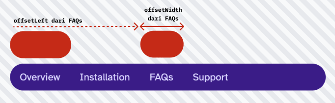
transform: translateX(x);. The value ofxis theoffsetLeftof the currently hovered element. - Set the
widthbased on theoffsetWidthof the currently hovered element.
Step 1: Basic Markup and Styling
This is the fundamental HTML structure and CSS.
<nav class="nav">   <!-- Highlighter -->   <div class="highlighter" aria-hidden="true"></div>
   <!-- Navigation items -->   <a href="#overview" class="nav-item">Overview</a>   <a href="#installation" class="nav-item">Installation</a>   <a href="#faqs" class="nav-item">FAQs</a>   <a href="#support" class="nav-item">Support</a></nav>
.nav { position: relative; display: flex; overflow: auto; background: white; border-radius: 99999px;}
.nav-item { padding: 0.5rem 1rem; text-decoration: none; cursor: pointer;}
.highlighter { position: absolute; left: 0; height: 100%; background-color: #fedf89; border-radius: 99999px;}Step 2: Add a mouseover Listener
To make the highlighter follow the mouse, we’ll attach a listener to each menu item. When a user hovers over an item, we’ll calculate the exact position and widthof the item and then apply these values to the highlighter. The position will be set via transform: translateX(...) where the value is set to the offsetLeft of the hovered menu item. And the width is set to match the offsetWidth of the hovered menu item via width property. These will create a dynamic effect that visually indicates which menu item is currently being hovered over.
const highlighter = document.querySelector('nav > .highlighter');const navItems = document.querySelectorAll('nav > .nav-item');
for (const navItem of navItems) {   navItem.addEventListener('mouseover', (e) => {      if (highlighter && e.currentTarget) {         highlighter.style.width = `${e.currentTarget.offsetWidth}px`;         highlighter.style.transform = `translateX(${e.currentTarget.offsetLeft}px)`;      }   });}
Step 3: Handle the Initial Hover
So far, we’ve met specifications 2 and 3. However, when we hover outside the navigation and then back onto an item, the highlighter might not behave as expected. Notice that the highlighter appears at the previously hovered element before moving to the new one. This behavior doesn’t align with specification 1. To fix this, we need to differentiate behavior between the first hover and subsequent hovers:
- Add a variable
enteredto track the hover state with the default value offalseto indicate that no element has been hovered over yet. - Upon the first hover over a navigation item, only transition the
opacityproperty and setenteredtotrue. - For subsequent hovers, transition the
opacity,transform, andwidthproperties. - When the hover leaves the navigation element (i.e.
.nav) element, setenteredback tofalse.
const highlighter = document.querySelector('.nav > .highlighter');const navItems = document.querySelectorAll('.nav > .nav-item');
let entered = false;
for (const navItem of navItems) {   navItem.addEventListener('mouseover', (e) => {      if (highlighter && e.currentTarget) {         highlighter.style.width = `${e.currentTarget.offsetWidth}px`;         highlighter.style.transform = `translateX(${e.currentTarget.offsetLeft}px)`;
         if (entered == true) {            highlighter.style.transitionProperty = 'width, transform, opacity';         } else {            highlighter.style.transitionProperty = 'opacity';            entered = true;         }      }   });}
document.querySelector('.nav')?.addEventListener('mouseleave', (e) => {   entered = false;});